 Airport Shuttle

Sign of the Times
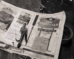
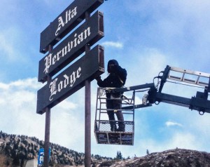
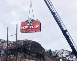
Prior to reopening this season, we installed a new Alta Peruvian Lodge road sign. The sign we replaced had been standing at the entrance of our parking lot since before our current owner John Cahill purchased the lodge in 1970. It was painted with the same dark brown color as the exterior of the lodge, and our name was cut into the wood in an Old-English font style which was painted white.
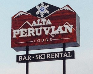
Our decision to replace the sign came about after a few years of consideration. First, we wanted something that was easier to read. The old style lettering, for some reason, caused some people to not readily recognize us as the Peruvian. We would often have travelers come into our lodge thinking that we were the Alta Lodge, which is further up the road. More importantly, we had also recently re-branded our lodge, developing a new logo to go along with the launch of our redesigned website. The new logo hearkened back to our pre-1992 logo which prominently featured the classic snowflake design. The old sign did not contain features of any branding that the Peruvian has ever utilized, so it seemed to stand apart from our other marketing efforts.
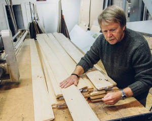
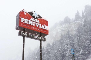
The new sign incorporates the artistic angled wood paneling design that is featured on our lobby walls and our front desk. The rich red color of the wood stain is reflective of the colors in the lodge’s Alf Engen Room, a large multipurpose gathering area that was added to the lodge in the 1980’s. This color stands our much more than the muted colors found on the old sign.
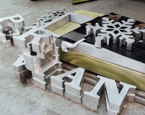
Finally, we opted for solid three-dimensional letters that are back lit. This has the nice effect of prominently highlighting our name without being too “loud” in terms of lighting. The middle of the snowflake has a transparent blue color which nicely tops off the logo and shines a beacon in the darkness. Once the sign was finally in place and the first snowfall landed on its face, I began to wonder if we made a mistake with the white three dimensional lettering. The snow was landing on the letters, obscuring their true shape. But after several storm cycles, I have come to appreciate the effect the snow has. The white powder on the white letters creates the effect of an ever-changing sign with letters that are made of snow. Even the mountains that are depicted in the paneling are sometimes topped off with fresh powder.
Miss the old sign? Don’t fret. The faces of it are currently in storage. Our plan is to repurpose them and incorporate them on the exterior of the building. Meanwhile, our new sign is ready to welcome visitors for decades to come.
